Inhaltliche Navigation
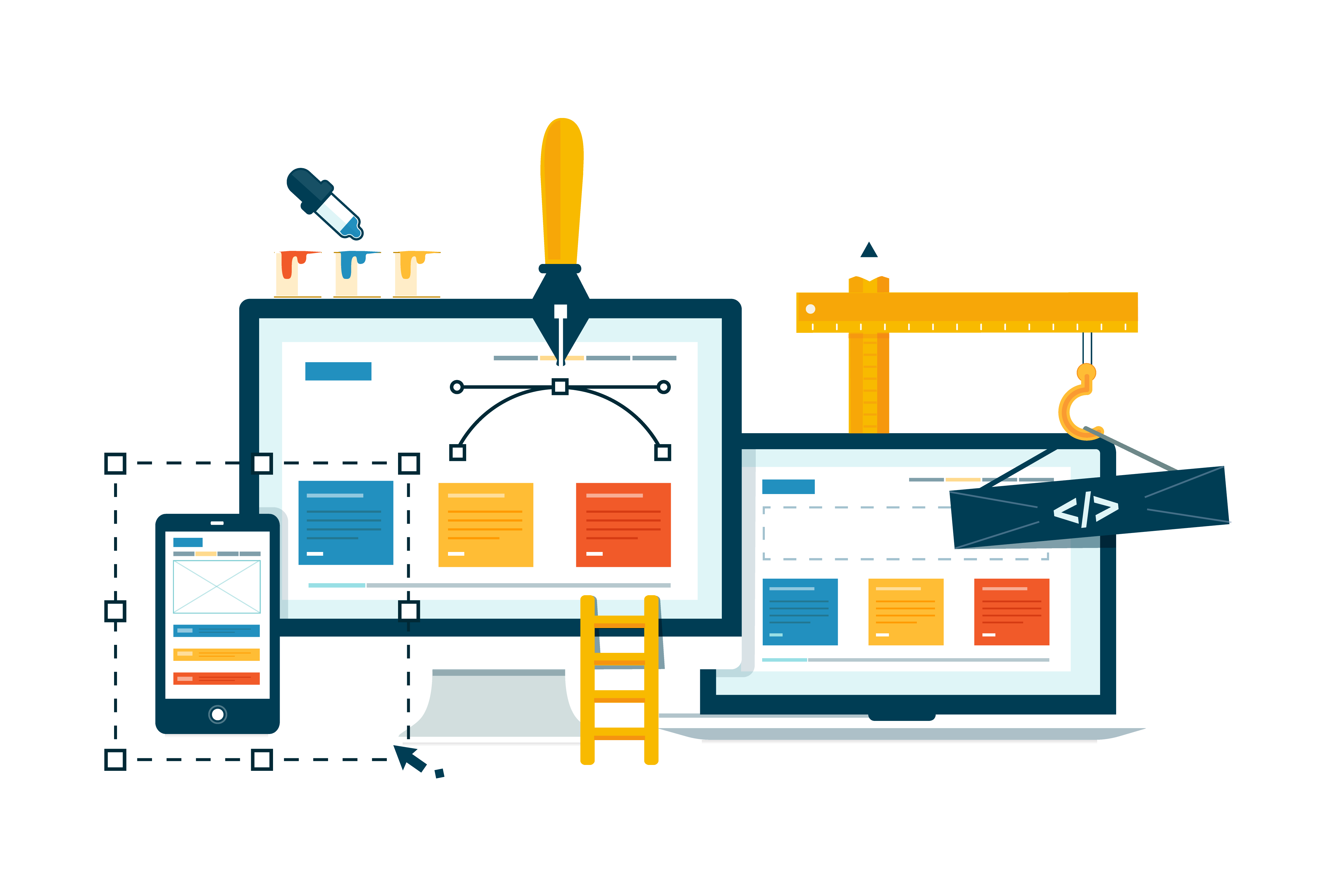
What is responsive design?


What is responsive design?
You've probably already visited a website on your smartphone or tablet that wasn't displayed correctly. The font was too small, the images too large or the navigation too complicated. This is because the website was not optimized for different screen sizes. To solve this problem, there is a technique called responsive design.
Responsive design means that a website adapts to the end device used to access it. Whether you are using a desktop PC, a laptop, a tablet or a smartphone, the website will always be optimally displayed and usable. This not only improves user-friendliness, but also search engine optimization and the loading time of the website.
How does responsive design work?
Responsive design is based on several techniques and methods that work together to create a flexible and adaptable website. The most important are:
- HTML5: This is the latest version of the language used to create websites. HTML5 offers new elements and attributes that make it possible to adapt content such as images, videos or text for different devices.
- CSS3: This is the latest version of the language used to design websites. CSS3 offers new functions and rules that make it possible to change the layout and design of a website for different devices.
- Media Queries: These are instructions in CSS3 that make it possible to change the appearance of a website depending on certain conditions. For example, you can specify that a website should look different with a screen width of less than 600 pixels than with a screen width of more than 600 pixels.
- Flexible units: These are units of measurement in CSS3 that adapt to the size of the screen. For example, you can specify that a font size corresponds to 2% of the screen width or that an image takes up 50% of the screen height.
- Multiple assets: These are different versions of a resource, such as an image or a video. For example, you can provide a smaller version of an image for small screens and a larger version for large screens.
- Mobile-first approach: This is a strategy in which you first design for mobile devices and then expand for larger devices. This has the advantage that you focus on the essentials and avoid unnecessary elements.
Why is responsive design important?
Responsive design is a must for every modern website these days. There are many reasons for this:
- User-friendliness: A responsive website offers a better user experience for all visitors, regardless of the end device. The content is always easy to read and navigate without having to zoom or scroll.
- Search engine optimization: A responsive website is preferred and ranked higher by search engines such as Google than a non-responsive website. This is because a responsive website only has one URL and is therefore easier to index. In addition, a responsive website reduces the bounce rate and increases the time visitors spend on the site.
- Loading time: A responsive website loads faster than a non-responsive website. This is because a responsive website only loads the resources that are required for the respective device. A responsive website also saves bandwidth and storage space.
How do you create a responsive website?
To create a responsive website, you need some knowledge of HTML5 and CSS3 as well as a good understanding of web design. However, there are also some tools and services that can help you with this:
- Website builder: This is an online service that allows you to create a responsive website yourself without any prior knowledge. You can choose from various templates and elements and customize them according to your wishes.
- Frameworks: These are collections of code snippets and rules that make it easier to create a responsive website. You only need to know the basics of HTML5 and CSS3 and can then use the ready-made solutions.
- Plugins: These are extensions for existing websites that make them responsive. All you have to do is install and activate the plugin and the website adapts to different devices.
Conclusion
Responsive design is a technique that makes it possible to optimize a website for different screen sizes. This has many advantages for user-friendliness, search engine optimization and the loading time of the website. To create a responsive website, you either need some knowledge of HTML5 and CSS3 or you can use a website builder, a framework or a plugin.
